Specialty Finishes




Specialty Finishes
Standard printing gets your message out. Specialty finishes make sure it's remembered. This is where you'll find every premium upgrade we offer — the details that turn a regular card, postcard, or folder into something people actually hold onto.
If terms like "spot UV" or "letterpress" don't mean much to you yet, that's completely normal — most people have never had a reason to learn them until they're picking finishes for their own print job. That's what this page is for: a plain-English explanation of each option, a real example of what it looks like in practice, and a sense of when it's actually worth choosing. No printing background required.
Every finish below is available across our product lines, not locked to just one item. Pick the finish first, then see everything you can apply it to — or start from the product you already have in mind and add a finish from there.
Foil Stamping
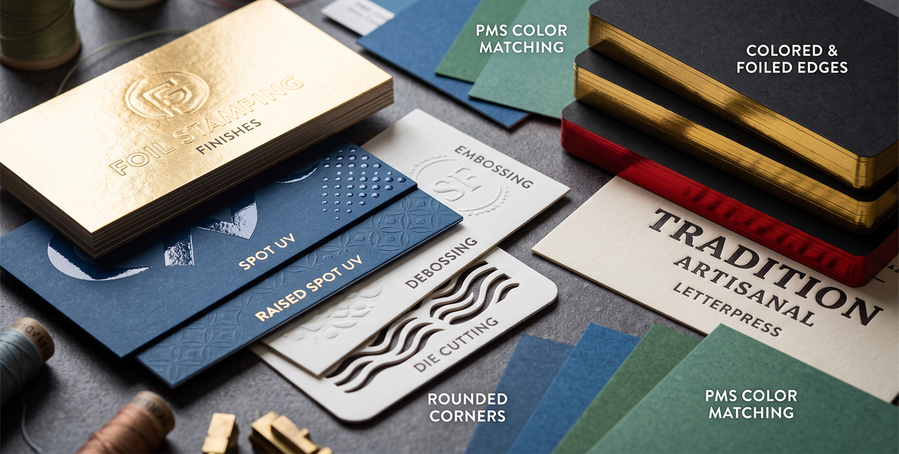
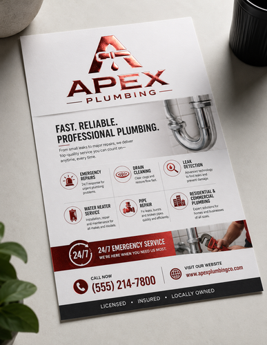
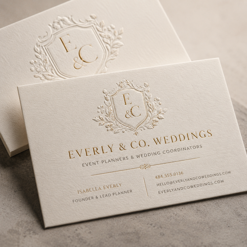
What it is: Foil stamping uses heat and pressure to press a thin layer of metallic (or colored) foil onto your paper. Unlike ink, foil sits on top of the surface and reflects light instead of just showing color.
What it looks like: Think of a wedding invitation with the couple's names pressed in gold foil, or a business card where just the logo catches the light when you tilt it.
Best for: Making a logo, name, or single design element visually pop without adding color across the whole piece.
Embossing & Debossing
What it is: Embossing raises a design up out of the paper so you can feel it with your fingers. Debossing does the opposite, pressing the design down into the paper. Neither uses ink or color — it's texture, not print.
What it looks like: A law firm's letterhead with initials pressed into a raised monogram, or a folder with a logo pressed subtly into the cover.
Best for: A quiet, high-end, tactile detail that doesn't rely on color or shine to make an impression.
Spot UV & Raised Spot UV
What it is: Spot UV adds a glossy coating over specific parts of a design on top of an otherwise matte surface, so just those areas shine. Raised Spot UV does the same thing but builds it up so you can feel the shape, not just see it.
What it looks like: A matte black business card where only the company name is glossy, or a postcard where an illustration has a raised, glassy shine.
Best for: Drawing the eye to one specific part of the design through contrast, not extra color.
Die Cutting
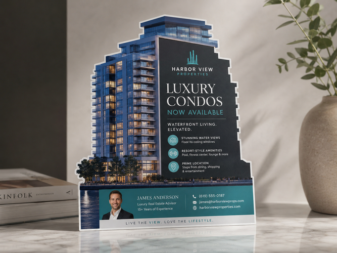
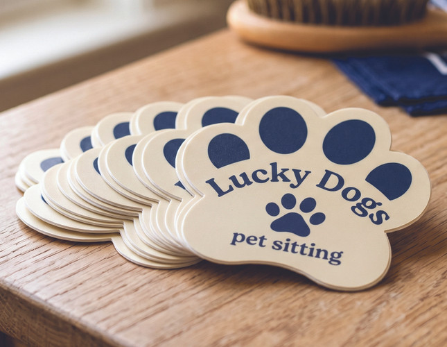
What it is: Die cutting uses a custom-shaped blade — or a laser, for finer detail — to cut your print piece into a shape other than a standard rectangle.
What it looks like: A tree service's business card cut into the shape of a leaf, or a postcard with a rounded arch cut into the top edge.
Best for: A shape that reinforces what you do, or simply standing out in a stack of standard rectangles.
Colored & Foiled Edges
What it is: Instead of leaving the edge of your card or piece plain white, we add a solid color — or a metallic foil — all the way around the border.
What it looks like: A black business card with a gold-painted edge that looks finished and expensive even when it's just sitting in a stack.
Best for: A premium detail that's noticeable even before someone picks the piece up.
Explore Colored & Foiled Edges →
Rounded Corners
What it is: Instead of sharp 90-degree corners, the corners are cut into a smooth curve.
What it looks like: Most loyalty cards, and a lot of modern business cards, use rounded corners for a softer, friendlier feel.
Best for: An easy, affordable upgrade that's also more comfortable in a wallet or pocket.
PMS Color Matching
What it is: PMS (Pantone Matching System) is a standardized color system that guarantees your exact brand color prints the same way every time, instead of shifting slightly the way standard 4-color printing sometimes can.
What it looks like: If your logo uses a specific shade of blue, PMS matching makes sure that blue looks identical on your business card, your postcard, and your folder — every time you reorder.
Best for: Brands that need consistent color across multiple print pieces or repeat orders.
Because PMS matching is a specialty request rather than something most orders need, you won't find it as a standard dropdown option or listed price on our product pages. If your project calls for it, just reach out directly — we'll quote it for your exact project and get it set up right.
Letterpress
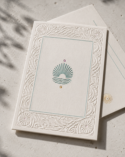
What it is: An old-school printing method where the design is physically pressed into the paper, leaving a slight indentation you can feel. It's different from embossing because letterpress typically uses ink, giving it a vintage, handmade look.
What it looks like: Wedding invitations or high-end stationery with a slightly indented, ink-filled design that feels almost hand-stamped.
Best for: A vintage, artisanal aesthetic that stands apart from anything digitally printed.
Not Sure Which One Fits?
That's what we're here for. Most customers combine two or more finishes — foil with a painted edge, embossing with rounded corners, spot UV with a die cut shape — and most of them didn't know these were options until they asked. Tell us what you're picturing (or even just what feeling you're going for), and we'll help you figure out which finish actually gets you there.