PMS Color Matching | Exact Pantone Color Print Matching | printshaQ
Posted by printshaQ.com | 20+ Years | Authority for Bespoke Specialty Print Finishes on 23rd Jul 2026
What Is PMS Color Matching? A No-Nonsense Guide to Getting Your Print Colors Exactly Right
If you've ever ordered business cards, packaging, or marketing materials and been disappointed that the "brand blue" came back looking nothing like your logo, you've run into the problem PMS color matching exists to solve.
It's one of those things that doesn't get talked about much on product pages — we mention it here and there as an add-on option — but it's honestly one of the most useful tools you have if color accuracy matters to your brand. So let's break down what it actually is, when you need it, and how it works when you order with us.
What Does PMS Actually Mean?
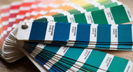
PMS stands for Pantone Matching System. It's a standardized color language used across the printing, design, and manufacturing industries. Every PMS color has its own reference number — like PMS 032U or PMS 279C — that corresponds to an exact, reproducible shade.
Think of it like a paint chip at the hardware store, except instead of "Eggshell White," you get a number that means the exact same color whether you're printing in Miami or Manila. That consistency is the entire point.
A Quick History: Why This System Exists in the First Place
Before Pantone came along in the 1960s, printers were mixing custom inks by eye, from memory, or off inconsistent physical samples. That meant "red" from one print shop could look completely different from "red" at the shop across town — there was no shared language for color at all.
Pantone's founder, Lawrence Herbert, set out to fix that by numbering and standardizing colors so that anyone, anywhere, could reference the exact same shade. It caught on fast, and within a couple of decades it became the industry standard for print, packaging, and eventually fashion and product design. That's the system we're still using today — PMS 032U means the same thing now that it did decades ago, which is exactly why brands can keep their colors locked in consistently for years.
Why It's Getting Harder to Find a Shop That Actually Offers This
Here's something worth being upfront about: true PMS color matching isn't something every print shop can do anymore, and it's getting harder to find, not easier.
Matching an exact Pantone ink takes real mixing knowledge, the right equipment, and a willingness to slow down and get it right rather than defaulting to a standard CMYK run. As more printing has shifted toward high-volume, automated digital presses built for speed, a lot of shops have quietly dropped true PMS matching from what they offer — it's easier and cheaper to just run everything through CMYK and call it "close enough."
That's part of why we still offer it. If color accuracy matters for your brand, you shouldn't have to settle for an approximation.
Why Regular Printing Doesn't Always Get the Color Right
Most everyday printing uses CMYK — four process colors (cyan, magenta, yellow, black) layered together to simulate the full spectrum. It's great for photos, gradients, and full-color designs. But CMYK is a simulation. It's mixing four inks to approximate a color, and that approximation can shift slightly depending on the printer, the paper, and the day of the week.
PMS works differently. Instead of mixing four inks and hoping they land close to the color you want, PMS uses a single pre-mixed ink formulated to hit that exact shade. No approximation, no guesswork — that's why brands with strict style guides (think Coca-Cola red or Tiffany blue) specify PMS colors, not CMYK values, when they hand off files to a printer.
Coated vs. Uncoated: The Detail Most People Miss
Here's where it gets a little more technical, and where most confusion happens: the same PMS number can look noticeably different depending on whether it's printed on coated or uncoated paper stock.
- Coated (C): Printed on glossy or satin stock. Colors appear more vibrant and saturated because the coating keeps ink from soaking into the paper.
- Uncoated (U): Printed on matte or textured stock. Colors look slightly more muted because the ink absorbs into the paper fibers.
That's why you'll often see PMS colors listed with a "C" or "U" at the end — PMS 032C versus PMS 032U aren't interchangeable, even though they're technically "the same" color. If you're matching to an existing brand asset, this distinction matters more than people expect.
When Does PMS Color Matching Actually Matter?
Not every project needs it. If you're printing a one-off flyer or something where "close enough" is fine, standard CMYK printing does the job and keeps costs down. But PMS matching is worth it when:
- You have established brand colors. If your logo uses a specific blue, green, or red that clients associate with your brand, PMS keeps that color consistent across every print run — this year, next year, and five years from now.
- You're ordering painted or colored edges. This is one of the most popular places we see PMS requested. A painted edge in an exact brand color looks intentional and premium; a slightly-off color looks like a mismatch.
- You're printing in bulk across multiple runs. Reordering the same product months apart? PMS ensures the new batch matches the old one instead of drifting into a slightly different shade.
- You're working with metallic, neon, or fluorescent colors. These are colors CMYK genuinely cannot reproduce well. If you want a true metallic gold or a punchy neon pink, PMS is really your only option.
How PMS Color Matching Works When You Order With Us
You don't need to be a print expert to use this — that's our job. Here's the simple version:
- Tell us the PMS number if you already have one (usually from your brand guidelines or a designer). If you don't have one, send us your logo or a reference image and we'll help identify the closest match.
- Let us know your paper stock and finish. Since coated and uncoated versions of the same PMS number look different, this affects which formula we use.
- We mix and match to that exact spec. Rather than approximating with CMYK, we use the Pantone-matched ink for your specific job.
This is available across a lot of our product line — painted edges, foil colors, and select ink runs — even though it's not always called out explicitly on every individual product page. If you're not sure whether it applies to what you're ordering, just ask. If PMS matching makes sense for your job, we'll tell you; if it doesn't, we'll tell you that too.
Common Questions
Do I need a Pantone book to order a PMS color? No, but it helps if you already know your number. If you don't, send us your logo, brand guide, or even a photo of something with the color you want, and we'll work from there.
Is PMS matching more expensive? It can carry a small premium over standard CMYK printing since it uses a dedicated ink rather than a standard four-color mix, but for brand-critical projects, it's usually worth it for the consistency alone.
Can I use PMS colors on any product? It's most commonly used for painted edges, foil colors, and certain ink applications. If you're not sure whether your specific product supports it, reach out and we'll confirm.
What if I only have an RGB or hex code, not a PMS number? That's fine — RGB and hex are screen colors, and PMS is a print color, so they don't always convert perfectly. We can help find the closest PMS equivalent to your digital brand color.
Need This on Your Next Order?
Since true PMS matching isn't something we advertise on every product page — and honestly, isn't something most shops offer at all anymore — the easiest way to get it is to just ask us directly.
If you have a specific PMS number, brand guideline, or even just a reference image of the color you need, email us at Sales@printshaQ.com and we'll confirm whether it's a fit for your product and walk you through the details from there.